Mobile vs Tablet User Interface (UI) Design - Key Differences Explained
Phone and tablet. Both are considered "mobile" devices, but from a UI perspective, they can be quite different. It might seem counter-intuitive to distinguish the phone from tablet development, after all, once you've designed for an iPhone 6+, where, really, is the difference in modifying that for a small tablet? Because both devices are handheld, use downloaded apps, and are operated by touch, there is a temptation to treat tablets as simply the largest phone size, which for many reasons we will discuss later, is the wrong way to approach tablet app development.
Should a tablet follow phone design, desktop design, or should it be its own separate size designation? There is a growing case to say that we have been looking at tablets wrong this whole time. But it turns out that there is still no definitive answer as to what tablets are. For the most part, users content themselves to using what functionality is available for the tablet, and developers and designers are already overwhelmed by perfecting mobile and let that work for tablet too. Tablets are currently in a transient state, sometimes grouped with phones, other times allowed to eat at the desktop table, and the rest of the time considered something else entirely. This is evident by the fact that they are designated as a separate device category for apps and often require separate app development, while tablet views are often treated as the largest phone size. So, should tablets share your mobile layout? The answer is usually "mostly". When developing for phone and tablet, there are some important differences to keep in mind to ensure a great experience for your users. These differences are all UI related, and deal with the context, adaptability, interactivity, and organization of your app at each size. Below we will walk through each area, contrasting for phone and tablet UI approaches.
Context
Phones are our day to day connectivity devices, and studies show we use them primarily to access our social networks, text messages, games, and on the go music. However, the most common uses for tablets are currently games and video content, as well as social networks. Users evidently have different expectations for their phones and tablets, and that must inform our design and UI decisions. The vital thing is to anticipate correctly the way users will want to use your app, and focus your design efforts on that primary use. Consider if users would prefer a portrait or landscape view, or even where they will be using your app. Is this a map app that people will hold the device in both hands to use? Will the device be on a wall, or will people use it to watch shows while laying down? Any context must be supported by the UI you choose, such as whether it is a one-hand friendly UI, or how many components and possible distractions you allow into the screen space. Consider the visual indicators you choose, making sure they are not heavy and don't draw attention to themselves, but rather point the user to the main functionality of the app. A great example of this is the iOS Weather app, which uses the whole screen (on tablet and phone) for background images, but makes those images reflect the weather being predicted for that user, which supports the main function and message of the app.
Good examples of UI for tablet apps: Youtube and paper (especially note the use of landscape mode)


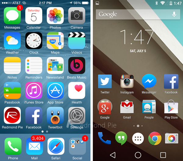
Good examples of UI for phones: Weather app on iOS, the Android and iOS home user interfaces

Adaptability

The ability of an app to perform in a user-friendly way no matter what the circumstances are important to overall satisfaction with the app. With phones, we might think less of this issue, because with less screen space there are fewer decisions to make, but on a tablet, this issue deserves some consideration. There is a big difference between landscape and portrait views, and the orientation users find most convenient says something about the way they are using the app. Many developers have found that tablets on portrait can follow the design and UI of phones, while tablet landscape can arrange content like a desktop and still give a great user experience. This way, the tablet is neither phone or desktop, but a convenient and user-centric breakpoint between the two. Remember though, that more screen should not mean more UI, and it will always be important to follow basic design principals that keep UI light and subtle.
Interactivity

Phone interactions are very utilitarian - only gestures that have a specific use are convenient because too many on a small screen can be confusing. On a tablet, however, your use of gestures and animations can shine. Have a reading app? Let people swipe and see the pages turn. Games also benefit from the wider space. Phones must hide their extra content in accessible layers, but tablets can let a bit more of that content come to the forefront, and allow users the entertainment of interacting with it. This absolutely does not work though, if you decide to split the screen into multiple sections that operate independently. It is often best practice to allow users to interact with the whole screen area, making full use of swipes, pinches, taps, long taps, and other tactile inputs will lead to a fun and interesting app your users will enjoy. Don't get carried away though, interacting with the app should not have a steep learning curve and cannot require too much effort. Gestures should never become a barrier to content.
Organization

UI components always seek to elevate and support content while affirming the app's core functionality. On such small screens, as most phones have, this means very subtle and unobtrusive UI elements. Things like tooltips, drop down menus, modal windows, and sliders should only be used sparingly when they perform a necessary function. When you have been developing for phones, however, a tablet screen might seem like a lot of real estate to play with, and bringing some more content into view is a great idea -- but don't go overboard. UI elements must still defer to content and functionality. The uncomplicated, streamlined approach necessary for phones encourages good design and should also be part of your tablet design. Keeping everything exactly the same as for your phone view however, is not ideal. For instance, tablets do not necessarily need the one column layout used for phones, a two column layout, especially for landscape views, is a great way to go for tablet. Especially because tablet users favor video and game content, we should pay careful attention to aesthetic integrity in tablet apps. Aesthetic integrity does not refer to the artistic beauty of an app, but rather how well the appearance and behavior of the app support the main function of the app. With so many high res images and videos happening, it will be especially important to make sure none of it detracts or distracts from what users should be getting out of the app.
We begin to see that, even within the world of "mobile" development and design, distinctions must be made when a change in user context occurs. To that end, keeping in mind the differences in common uses and subsequent UI changes for phone and tablet apps is incredibly beneficial. Making use of the advantages that present themselves at each device size will allow for a full and satisfying user experience on each screen size. This absolutely does not mean, however, that you should feel under pressure to create optimized experiences for phone, desktop, and tablet all at the same time, especially if you are starting something new. It would actually be detrimental to try and run at all three of these at once. Instead, determine which devices in which contexts your customers will most likely find themselves, and make those the focus of your development. You can always branch out to other devices later on as it becomes beneficial. Developing for phone and tablet will always be linked, and becomes more necessary all the time, but their differences are worthy of distinction, and if we pay attention we can create better user experiences across both sizes.
Our product development experts are eager to learn more about your project and deliver an experience your customers and stakeholders love.


